
How to Create a Waterfall Chart in Excel
Part of what makes Excel so great is the way you can create great visualizations of data. It isn’t all about performing complex calculations and tracking action items.
If you pursue a career in consulting, one of your primary objectives is to break down complex topics and issues into chunks that are digestible AND impactful for your audience.
Let’s say you come up with a revenue growth plan, but the growth will be comprised of multiple elements that will be implemented across multiple years.
Your first instinct might be to use a pie chart. Don’t do it. Unless you are talking about actual pie.
A better way to show this data would be to put it in a waterfall chart.
Here’s how you do it:
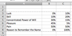
- Fill in each category/time period in one column (e.g. column A)
- Skip a column and fill in the values you want to show (e.g. column C)
- Update the middle column (e.g. column B) to show the cumulative amount/percentage to reflect the air you expect to see under each category.
Once you have your table created, highlight the table, and create a stack column chart.
After that, right click the data series, and set the fill, line, and shadow values to none.
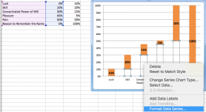
Delete the legend and voila! You have a nice waterfall chart that does a nice job showing the build up to your final projection.
Want to see Excel waterfall charts in action?
Learn more about this course where I give this lesson as a bonus for new students.